IMN #30 — Amber Vittoria
It's Monday Night #30
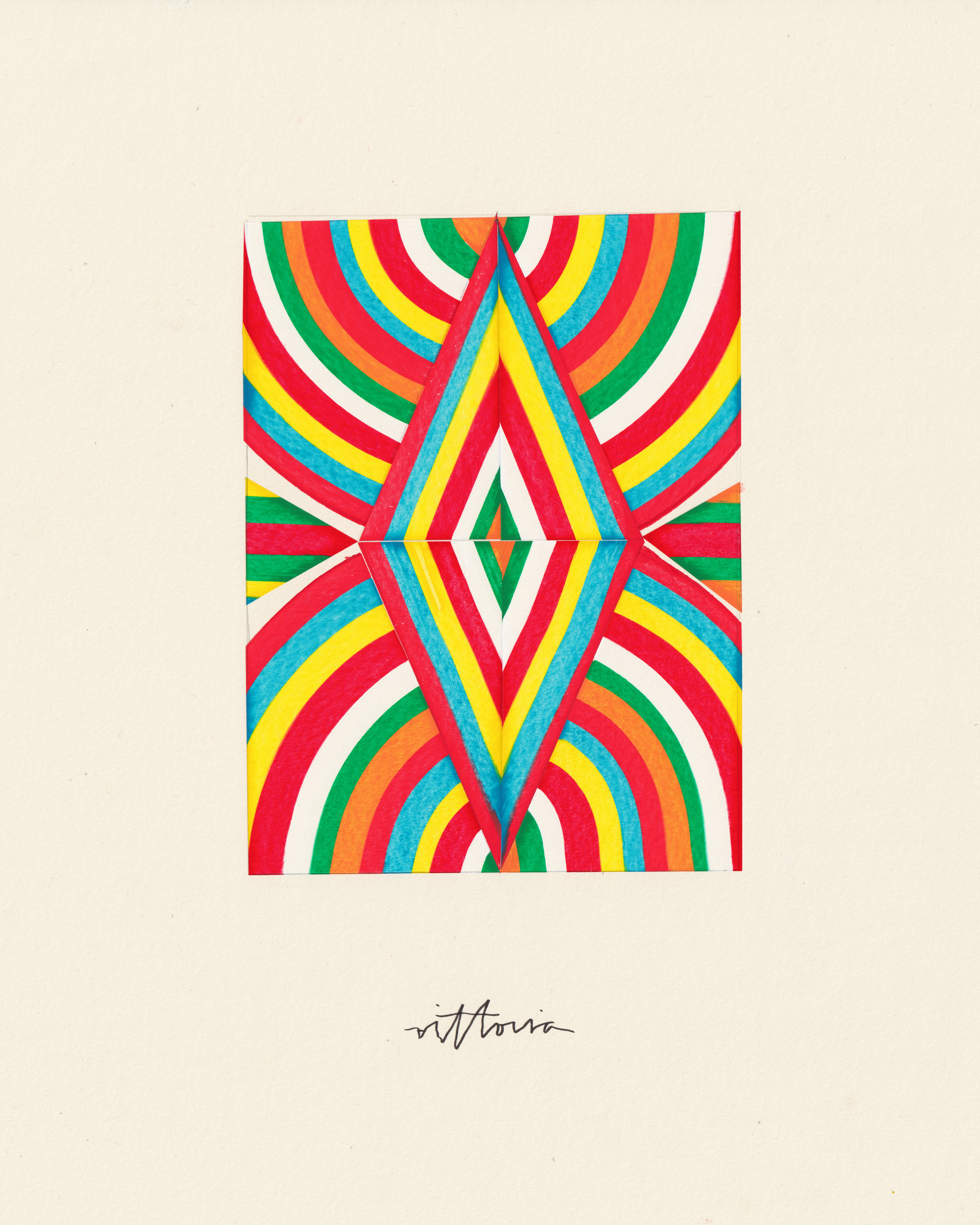
Tonight, let’s share thoughts about @amber_vittoria's work: a body to body with color of a great geometric & chromatic simplicity - each of her works seeks a tonal harmony which will make the color speak without weakening its vibration.
One could describe @amber_vittoria's visual language as a vast investigation into simultaneous contrasts and complementarities between colors.
For her, color is not primarily abstract, spiritual, mystical; it is a concrete reality: @amber_vittoria has taken note of the optical and physical theories on the decomposition of light.
Each color is a branch or portion of the visible spectrum - that is, a frequency, the vibration's signature.
Between the color and the sound, there is a relation of strict analogy - the color is, also, a wave which propagates in a medium.
All of @amber_vittoria's painting and drawing is a game of decomposition and recomposition of the light spectrum.
Indeed, she allows herself to invert the position of colors on the arc or on the ribbons of color: the eye recognizes the shape of the spectrum but it is constantly disoriented by more or less unusual chromatic sequences.
Thus, @amber_vittoria never stops exploring new color combinations in search of unexpected tonal harmonies. She is interested in the power of contrast that any color carries when it is associated, stuck, brought closer to such or such other specific color.
Sometimes the colors are separated only by small intervals - we can say that they have a neighboring or close vibration, which is expressed by a contact or by a continuity that is almost without transition.
Sometimes, on the contrary, the colors are separated by large intervals and their coming together is an event that cannot take place without violence. Her ink, colored pencil & acrylic paintings are an experimentation on the life or "activity" - since color is active - of color.
Each piece is like a force field in which a whole range of chromatic actions and reactions can occur. From this point of view, her visual language seems to me close to that of Sonia and Robert Delaunay (even if there is a remarkable difference between Sonia's and Robert's work).
It is the enigma of color that interests @amber_vittoria - fascinating but disturbing enigma: the ability to surpass or project itself beyond itself, by a radiation that modifies, colonizes or dominates everything that surrounds it.
In short, the color colors - not only the area of the canvas it covers, but also those it doesn't cover and to which it is linked by secret balances of power.
The color is not only filling an empty space, it is also and especially an aura or a halo which transgresses any spatial delimitation.
However, the work of @amber_vittoria does not lead to abandon the line, the outline, the contours in favor of surfaces or colored volumes.
The vibrant radiation of color is contained or held back, it is, so to speak, tightly structured - enclosed and channeled in bright, raw ribbons, stripes and stains.
In other words, color in @amber_vittoria's paint does not drool, it moves, but its movement is in a sense disciplined, organized.
When there is an overflow - as it happens in some of her paintings - it is a real revolution: as if a chromatic mixture was never the result of a conscious decision of the artist, but of an elective affinity between two colors placed too close to each other.
Most of the time, colors are quiet, so to speak: contrasts are clear, borders are respected. Colors run together or in parallel but do not touch each other beyond a line of contact. Composition builds a certain pictorial balance, whereby geometry prevails over pigment.
At the same time, we feel that it is the chromatic energy that distorts the line - often a simple grey pencil line, on the verge of erasure. Lines that should be straight and parallel lean or tilt towards each other by virtue of the colored intensities they delineate.
Sometimes, therefore, the line is present, but twisted by the color; sometimes, the line is absent, but the contrast between the colors is so strong that it is enough to materialize a segment, an outline, an impassable length.
Thus, @amber_vittoria does not shun brutal contrasts, frontal and almost rigid oppositions between colors located by their vibration at opposite ends of the light spectrum.
The diagrammatic structure of @amber_vittoria's paintings seems to bring them closer to the schema - a simplifying mode of representation that begins by abstracting a number of its properties from perception.
However, what "remains" once the process of abstraction has been completed is precisely the most concrete part in perception: the sensitive flesh of the world, as it appears to us here and now.
What stands out in @amber_vittoria's work is the ability of colored matter to structure itself, independently of any conscious aim or intention; in other words, it is the emergence of form out of the dance of colors.
I would say of @amber_vittoria's work that it embodies a threatened formalism, where all the elements seem wise, stable and immobile, but in reality only hold together by a fragile, precarious equilibrium:
The life of the colors destroys the harmony that it contributes to create; it undoes the space to which it gives an architecture.
Between the movement of the color and the static geometry of the contours, there is the rhythm, which often gives rise to a symphony or polyphony of colored surfaces.
It is not by chance that one would swear that each painting of @amber_vittoria can be read as a score of the inner life and the flow of consciousness.
With @amber_vittoria, one must also "listen" to the painting: be attentive to what comes back at regular intervals; to the alternation of strong and weak beats; to major and minor lines.
It is the rhythm that defines dynamic visual paths (ascending, descending or horizontal) that are, most of the time, disturbed, dislocated and thwarted by imperfect nesting, acute angle or irregular parallelism.
The circle, the triangle, the curve are the main vehicles, modules of the color, and the pseudo-symmetry is the dominant principle of construction.
If the inner or spiritual life cannot be represented by an image, but only suggested by a play with colors, results cannot obey any norm:
It is an unfolding under tension, a delicate yet powerful balance - the inner life appears to us in a limp, asymmetrical, off-center, yet shimmering, vibrant and organic form.